As a professional WordPress developer, I understand the importance of mobile usability when it comes to a website’s success. With more and more users browsing the internet on their mobile devices, it’s crucial for websites to be optimized for mobile use.
In this article, I’ll share some tips and tricks on how to fix mobile usability issues in WordPress.
6 Ways To Fix Mobile Usability Issues In WordPress:
1- Use a Mobile-Friendly Theme

The first step in ensuring your website is mobile-friendly is to use a mobile-friendly theme. This means selecting a theme that is optimized for mobile use and provides a good user experience on smaller screens.
There are many mobile-friendly themes available in the WordPress theme directory, so take the time to find one that suits your website’s needs.
2- Test Your Website’s Mobile Usability
The next step is to test your website’s mobile usability. Google provides a free tool called the Mobile-Friendly Test, which analyzes your website’s mobile usability and provides suggestions on how to improve it.
Simply enter your website’s URL into the tool and wait for the results.
3- Optimize Your Images
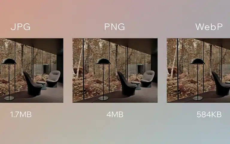
One of the most common mobile usability issues is slow loading times. To combat this, it’s important to optimize your images for mobile use. This means compressing them to reduce their file size without sacrificing image quality.
There are many plugins available in the WordPress plugin directory that can help you optimize your images, such as WP Smush and EWWW Image Optimizer.
Also Read: How To Remove Obj In A Box In WordPress?
4- Use Responsive Design
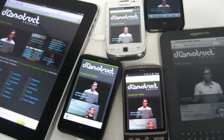
Responsive Design is a design technique that allows your website to adapt to different screen sizes. This means your website will look great on any device, whether it’s a desktop computer, tablet, or smartphone.
Most modern WordPress themes come with a responsive design built-in, but it’s important to double-check and make sure your website is responsive.
5- Minimize Your Use of Pop-Ups and Interstitials
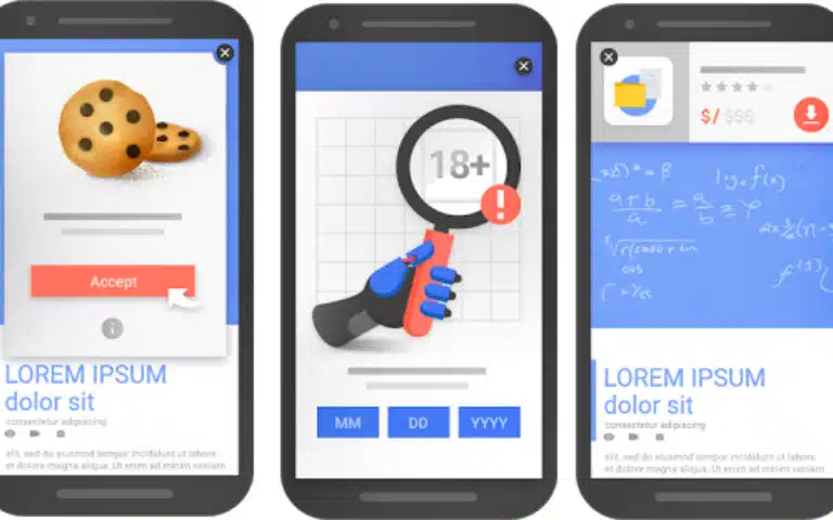
While pop-ups and interstitials can be effective in capturing a user’s attention, they can also be very annoying on mobile devices. This is because they can be difficult to close and take up valuable screen space.
If you must use pop-ups or interstitials, make sure they are easy to close and do not interfere with the user’s ability to navigate your website.
6- Ensure Your Font Sizes Are Legible

Lastly, it’s important to make sure your font sizes are legible on mobile devices. This means using a font size that is large enough to read on a small screen.
A good rule of thumb is to use a font size of at least 16px for body text and 22px for headlines.
FAQs about How To Fix Mobile Usability Issues In WordPress:
How do I fix mobile-friendly issues in WordPress?
To fix mobile-friendly issues in WordPress, ensure your site is responsive, optimize images and videos, use a mobile-friendly theme, and test with Google’s Mobile-Friendly Test tool.
How do I fix mobile usability issues detected?
I recommend fixing mobile usability issues by optimizing the website’s design and content for mobile devices. This includes using a responsive theme, optimizing images, and ensuring fast page load speeds.
How do I make my WordPress site mobile-friendly?
As a professional WordPress developer, I recommend using a mobile-responsive theme, optimizing images, and enabling caching to make your site mobile-friendly. You can also test your site’s mobile-friendliness using Google’s Mobile-Friendly Test.
How do I edit a mobile version of a WordPress site without affecting its desktop view?
As a WordPress developer, I suggest using a responsive theme and testing it thoroughly. Also, consider using plugins like WPtouch to create a separate mobile view. To edit the mobile view without affecting the desktop view, use CSS media queries to target specific screen sizes.
Conclusion
In conclusion, mobile usability is a crucial factor in a website’s success. By following these tips and tricks, you can ensure your website is optimized for mobile use and provides a great user experience on any device.
If you have any questions or comments, feel free to leave them in the comments section below.
